It's an advertisement for the book Shift Happens, a 3 part full-color book about the evolution of typewriters that was originally funded on Kickstarter and should be shipping soon (with limited overflow stock available). I'm patiently waiting for my copy:
https://shifthappens.backerkit.com/hosted_preorders
This is a fun tech demo but it's a terrible experience for a quiz (dragging around, not being able to see the keys on the other face, having to mouse over to reveal the important details)
I'm curious if the average developer would consider text appearing with no actual motion (no scale, pan, translate, fade, no tween whatsoever) a candidate to disable for @prefers-reduce-motion
I suspect the average web developer doesn't know or care about @prefers-reduce-motion (even less than @prefers-color-scheme), but for the few that do, I would expect to err on the side of caution, eliminating any animation and any page change that is not made absolutely necessary by user interaction.
Yes, I was recently playing some retro games from the 8-bit era and lots of them did it with clicking noises that I assume were meant to simulate a teletype.
This little game is an offshoot of Marcin Wichary's painstaking process producing his book Shift Happens. You can read a bit more about how he came to build a 3d viewer simulation of his book covers here: https://newsletter.shifthappens.site/archive/cover-story-pt-...
That's just one of 46 newsletter entries. Marcin's been working on this book now for 5, 10 years. And documenting the process in meticulous detail, down to choosing and testing the varnish for the slipcover and then simulating shifting light across it in a browser game. It's been a delight to follow along and I can't wait to get my copy of the book.
Contrast exists for a reason. Grey on grey is not contrast.
Please make it readable.
Well I won't buy the book obviously written by artists who think things just need to be pretty but not by designers who look at the functionality as well as the prettyness
WHat do you mean by levels?
I see no white (well the key names are but you don't see them until you click. Purple on purple is just not readable. Purple on white as the text on the page is would be much better.
The keys in the game are grey on black. 9OK shades of purple) Safari Arc and Firefox tried
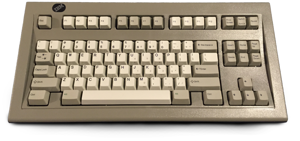
I honestly can't say I've ever seen a computer keyboard that has a symbol on the shift key. The text implying that it's common took me quite by surprise.
AZERTY keyboards for instance have it, since "Shift" is not a native French word (sometimes they do write "Maj.", but mostly they simply use the arrow). Also happens with some keys such as Caps Lock (a padlock symbol).
It's an advertisement for the book Shift Happens, a 3 part full-color book about the evolution of typewriters that was originally funded on Kickstarter and should be shipping soon (with limited overflow stock available). I'm patiently waiting for my copy: https://shifthappens.backerkit.com/hosted_preorders
I heard about it on Brad and Will Made a Tech Pod, when they did a long interview with the writer about the process of researching and creating it: https://techpod.content.town/episodes/171-gratuitous-stroke