Hacker Newsnew | past | comments | ask | show | jobs | submitlogin

No offense but the logo looks disgusting.


Posting a reply since there is validity to the terse comment.

I clicked out of curiosity and my trypophobia was definitely triggered. Probably due to the numerous “holes” around the edges of the sloth.

Those who don’t have trypophobia understandably would think it’s ridiculous. But as someone who feels it for whatever reason, it’s totally real.


I don’t have trypophobia, but the logo reminds me of some sort of hideous alien slug


> Probably due to the numerous “holes” around the edges of the sloth.

Isn't it sort of the point? Since the app is showing you all the ports (i.e. "holes") that are open?


Definitely one of the ugliest looking logos I've seen in a long time


Sharing the sentiment.

The logo looks competently drawn and is better at bigger scales where the details are clearer, but from a distance it caused me a visceral rejection reaction.

A sloth drawn with less fur detail would be simply cute, for instance: https://media.tenor.com/yypYI980ipUAAAAC/sloth-animal.gif


Disgusting is harsh, but it does look weird. It makes me think of some kind of single-celled organism or maybe an upside down turkey head and neck.


I thought it was a bloodworm at first: https://www.youtube.com/watch?v=o7aM5gU8mFY

Somebody needs Cayce Pollard (https://www.goodreads.com/en/book/show/22320) to have a look.


Some constructive advice to the author, if they're lurking: "Good" logos economize on details to maximize impression and versatility. Use fewer and simpler shapes to communicate better. Or maybe let an AI tool have at it?


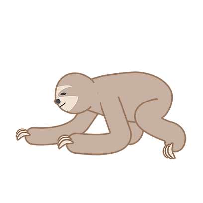
Another note to the author if they see this. I don’t find the logo offensive like the sibling commenters. I love the creative process and wasted days making logos which other people found unpalatable. People have visceral responses to logos for better or worse, which is why logos have become so boring over time - it’s just safer. But I do not hate the sloth


Not sure if it still works, but on macOS previously you could Command-I (Info) on two files, click the icon in one info window (highlighting it), and copy-paste on the other.

Quick fix for ugly app icons.


Agreed. The style looks nice and idea clear. But the details make this look unsettling, like early versions of AI generated human faces, resulting in creepy output


As a simple alternative, I had good results using Craiyon with prompts like "cute sloth, company logo, vector art, simple".


Guidelines | FAQ | Lists | API | Security | Legal | Apply to YC | Contact

Search: